Designing for User Retention: A Case Study of a Health Tracking App
Role - Product Designer
Project Type - Conceptual Design Project
Timeline - February to April 2022
Duration - 2 months end-to-end design process
Type of Design Services Offered - UI / UX, designing for new mobile app experience
Overview
Can a new messaging feature save the day?
- This project is a demonstration of my UX design skills and was developed in response to a design prompt - the resulting case study showcases my ability to design under a business constraint
- Vivace Health is a well-established company that launched a family and friends health-tracking application three years ago for both iOS and Android
- Current users can set individual goals, monitor them, and once achieved, display them on the home screen. However, there is no incentive or prompts that encourage users to open the application again
- I was engaged by the company to understand why current users aren’t coming back into the app. In addition, to design and validate features that would help with user retention.
The Challenge
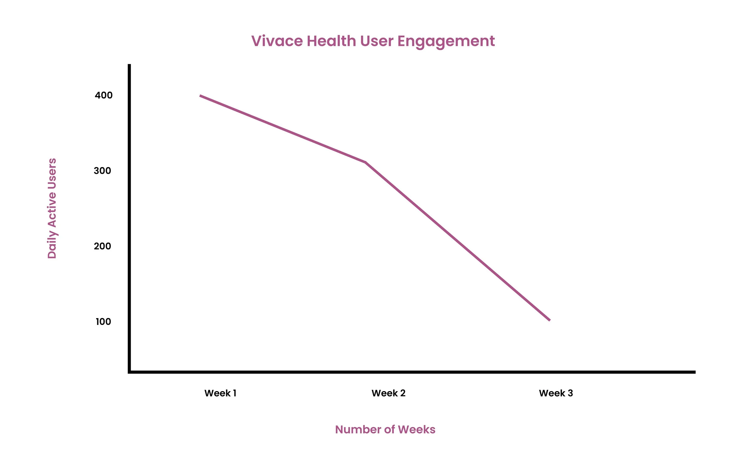
A 3-week app utilization rate
According to Vivace Health’s project manager, the average user engagement is heavy for the first three weeks of app utilization, then it drops off, and soon after users delete the app altogether. The company suspected that without social factors to share users’ progress, memories, and metrics, it’s hard for users to be incentivized or stay motivated on the app for more than the first few weeks. Thus, the project manager came up with the following hypothesis that I also considered:
“If allowing users to message each other with health and fitness goals/achievements within an integrated messaging experience throughout the product will increase user engagement and repeated usage”.
Research
Vicarious learning and social value drive motivation and engagement
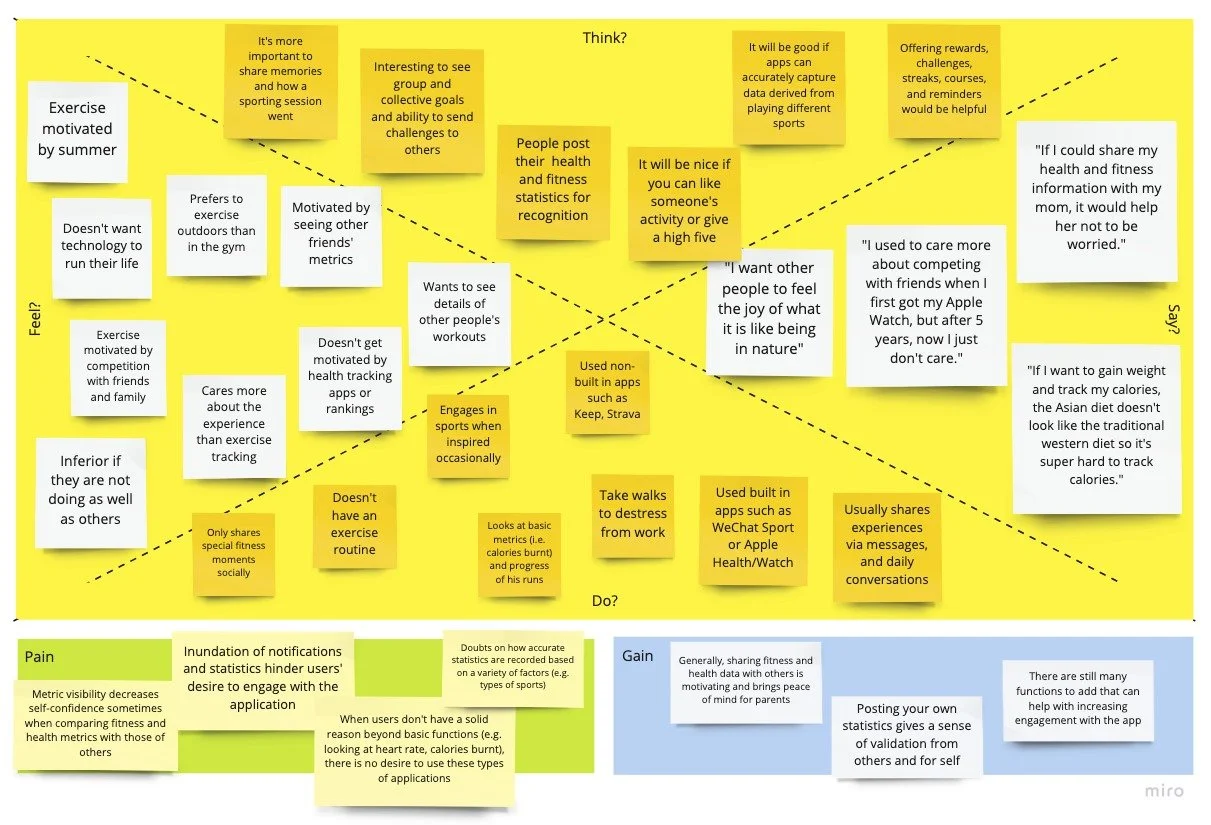
I did a lot of discovery work which included studying industry leaders and conducting 5 user interviews with people who have experience with health-tracking applications. Here are the top things I learned:
1. Vicarious learning and social value are the main sources of motivation when it comes to increasing engagement in a health tracking or habit application.
- Many motivating features within fitness and health tracking applications utilize vicarious learning, defined by people learning a new behavior after being exposed to an inspiring action they saw someone else perform
- Consumers that focus on social value, defined as the quantification of the relative importance that people place on the changes they experience in their lives, showed better performance engaging with the application and have higher intentions of continuing the use of the application
- Thus, when we combine vicarious learning with the effect of social value, we maximize the chances of increased user engagement
2. Health and fitness app users want to connect with communities by sharing progress, memories, goals, challenges, and statistics to motivate themselves through the health and fitness process
- “I want to create group goals and challenges so that I can connect more with people I care about while motivating each other to push through a common target at the same time.”
- “I want to share how a sports session went so that I can share my memories with friends and family and let them know I am doing well, especially when I live far away.”
- “I want to accurately capture statistics when I play different sports so that I can expand my sports interests and have a more holistic understanding of my progress.”
The Goal
How might we drive repeated app usage and increase user engagement for health and fitness enthusiasts?
After understanding that without sufficient value, it leads to the app not pulling users back onto the platform enough. I further reframed the hypothesis given to me to the following statement:
“Creating more value-driving social features and allowing users to share health and fitness progress within an integrated experience will increase user engagement and repeated usage”.
Ideation
Incorporating social interaction through learning, tracking, and messaging
I had a couple of concepts in mind that would move the needle that I wanted to further validate/invalidate. The following ideas aimed to improve user retention by boosting the social value of the app and promoting vicarious learning:
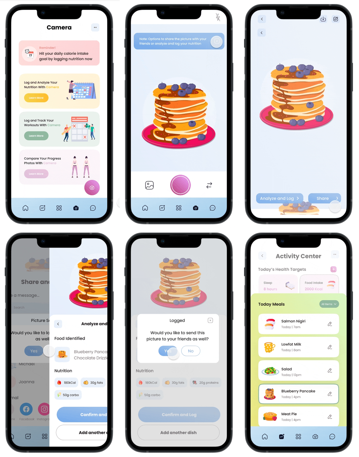
1. Camera - the ability to log, track, and share meals, sports, and memories with your friends and family by taking a picture
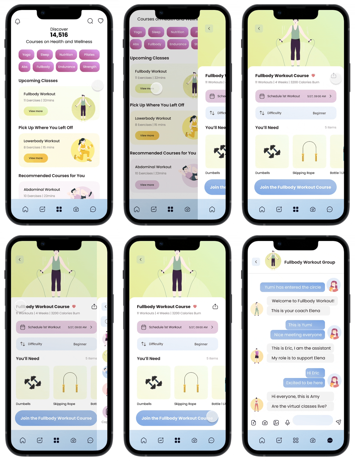
2. Courses - share, schedule, and join health and fitness-related courses with friends and family
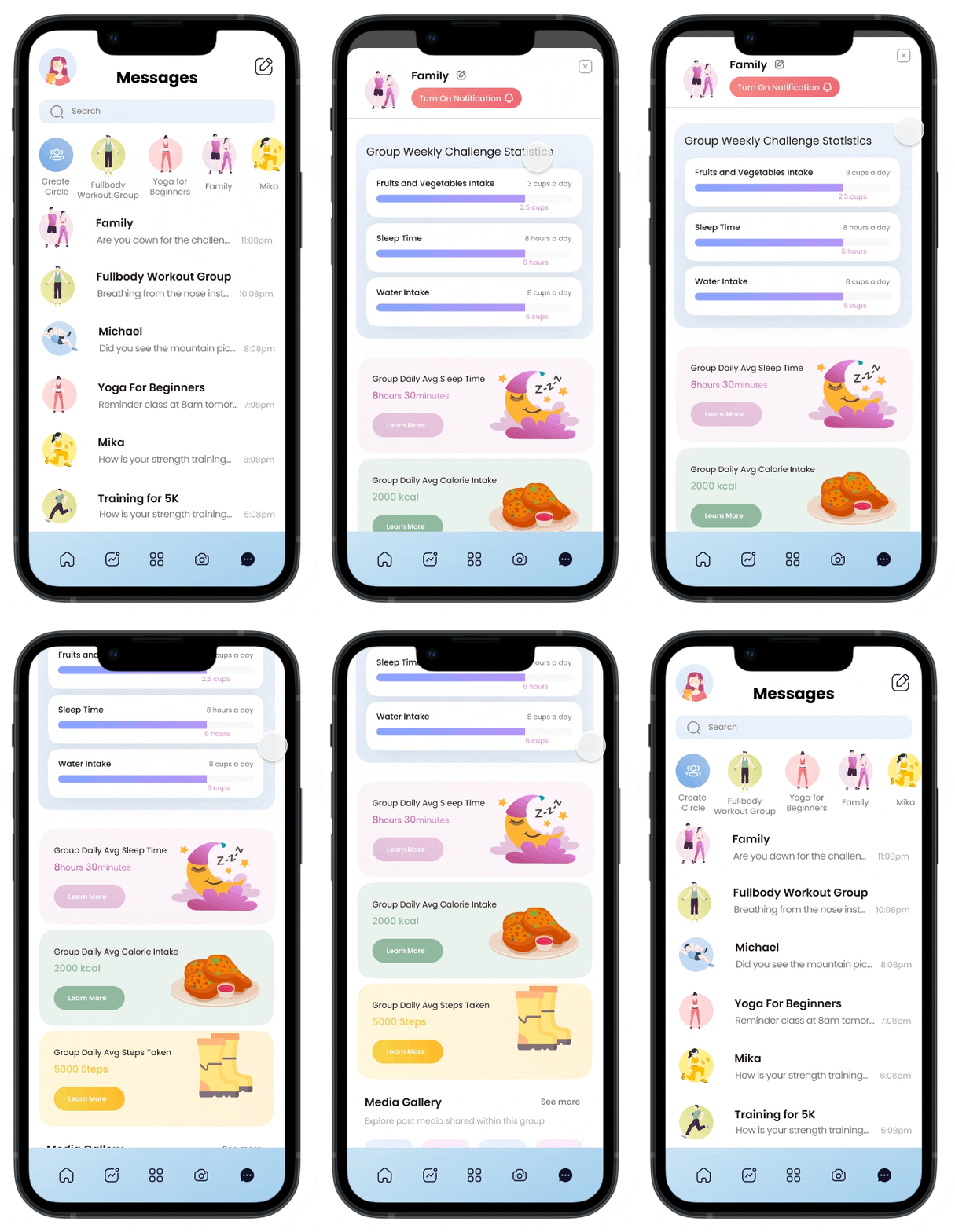
3. Messages - message friends and family about statistics, group goals, courses, and memories people have shared through the camera.
Original Concept + Two Rounds of Usability Testing
Incorporating social interaction through learning, tracking, and messaging
I decided to set up the following 5 tasks for the usability testing with 5 tech-savvy users who are in their twenties via 30-minute Zoom meetings within the span of a few hours. In general, users were able to navigate most of the flow with no difficulty and they loved the colorful UI, the breakdown of goals and actual metrics measured, and the addition of a family group space.
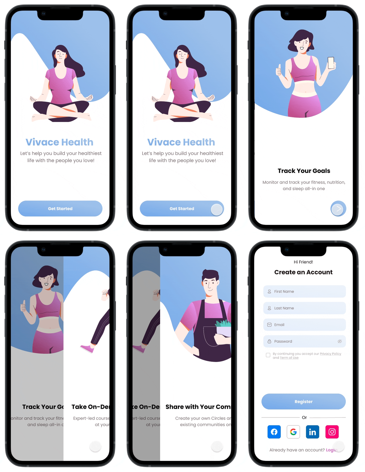
1. Personalized onboarding questionnaire
- Besides the typical onboarding experience that explains highly interactive functions within the app, I added two questions to understand the demographic’s needs first in order to create more value within the ecosystem:
What are your goals?
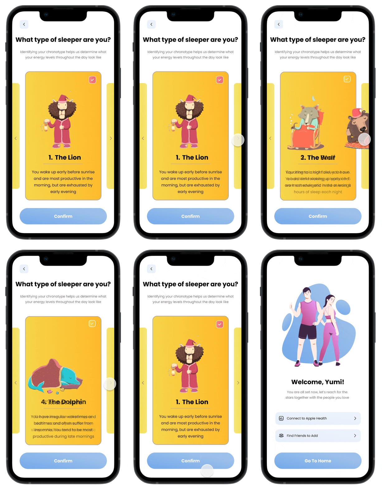
What type of sleeper are you?
- Understanding what goals the users have come into the app will help the company choose the best recommendation for the users; and
- Identifying users’ sleep chronotypes helps determine what their energy levels throughout the day look like, which in turn determines what type of experience best suit them (i.e., type of classes, hours of sleep they need, etc.)
2. Notifications within the homepage and activity tracker:
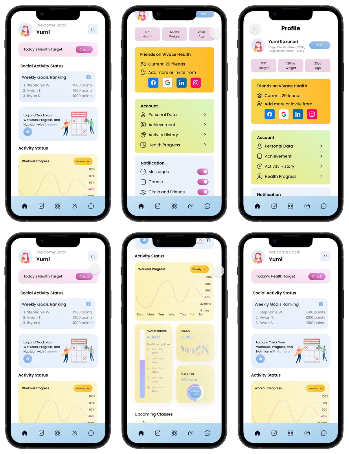
- As we go into the homepage and activity tracker, I included a linked notification page and the latest activity to make sure the app is bringing people back onto the platform
- In addition, the goal ranking section on the top of the homepage draws users in by bringing out the competitiveness and socializing desires within them to further retain users on the application.
- During the usability tests, however, users were…
1. Confused about the multiple layers and metrics within the activity tracker e.g., the daily goal chart and how the points system plays in the application; and
2. Though there were too many things going on the homepage they were overwhelmed with the information presented
Homepage
Activity Tracker
3. Share a workout class with friends and family:
- Based on the preliminary questions, users get automatic recommendations from the app on the type of classes they’d like to join;
- By allowing users to share details of the course with friends and family on the app and have the option to join a course-specific group chat to interact with others who are working towards the same goals, users have more incentivized to persist in their progress and utilization on the app;
- Note that to account for the freedom of users’ choice, it is optional to join the group chat; and
- Based on the usability tests, users loved this functionality but initially couldn’t understand what to do with the discovery tab from the icon or UI interface.
4. Capture a photo and share it with a friend:
- The feature allows users to take a picture of their activity (e.g., food), and either message friends and family or engage in a nutrition analysis to log the details into their activity statistics within the app;
- This allows users to not only log their activity but also share with people they care about in the app, creating a full and dynamic circle for the user experience to increase sustained engagement;
- In general, from the usability tests, users loved the potential of camera functionality but couldn’t understand what to do with the camera tab from the icon or UI interface;
To address this confusion about the camera’s purpose, I added a preliminary screen and a banner on the camera screen to explain that we can record, log, and share nutrition, workouts, and memories with friends and families on the platform
- In addition, to address a few edge cases:
1. I added a row of social media to allow users to share outside of the app to increase user engagement and outreach to non-users; and
2. Added a button to add another dish since users reflected the desire to get back to the camera quickly in case they want to take another picture right after.
5. Socialized with and message your friends, family, or workout group:
- Lastly, the message function is a straightforward space to interact with friends, family, and groups you are in on the platform;
- The function encourages friends of friends to join the app through word of mouth and also retain users on the platform through continuous messaging from users’ social circles;
- Since users thought it’d be great if they are also able to add friends from their social media or see other people’s fitness metrics, I added a family group page from one of the messaging group chats to allow users to see group goals, statistics to further enhance concepts of vicarious learning and social value to boost user engagement.
The Final Solution
The benefits of simplification
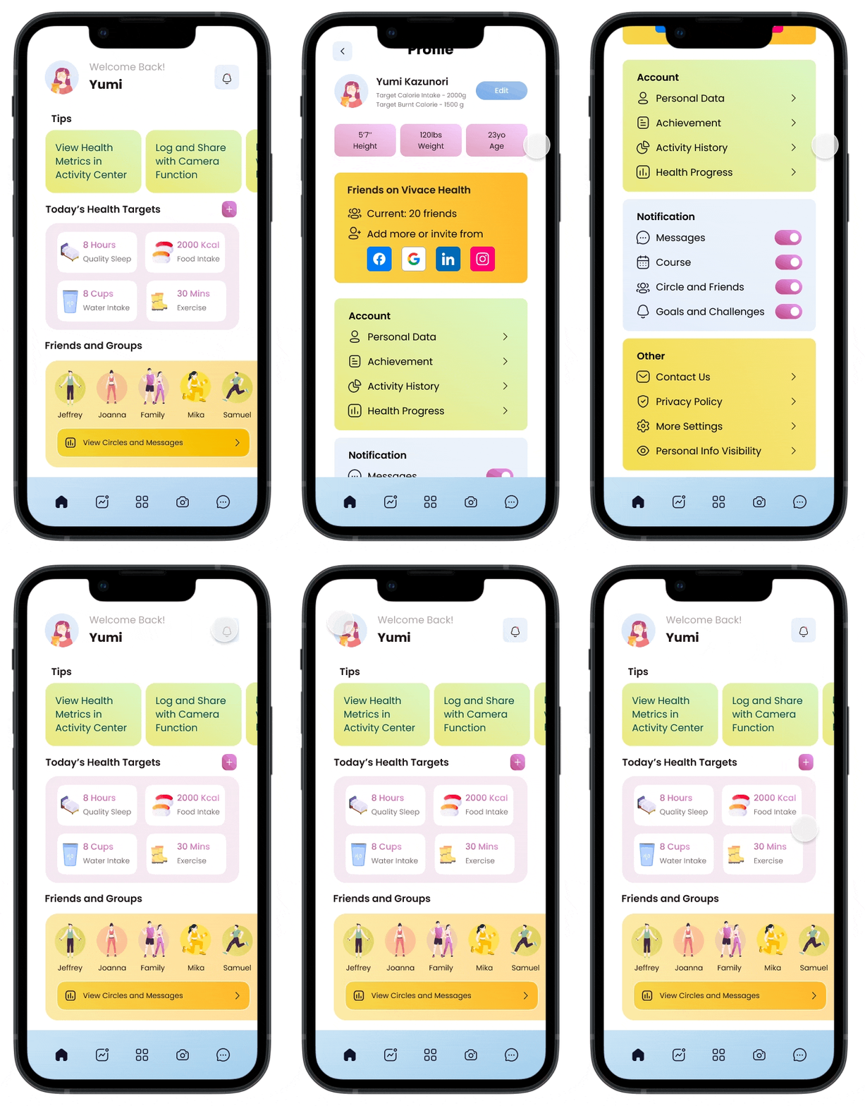
1. Homepage
- Trimmed down the homepage design and added a tip section to explain a breakdown of functions
- Pulled the existing friends and groups to the homepage so that it has a heavier emphasis on social value
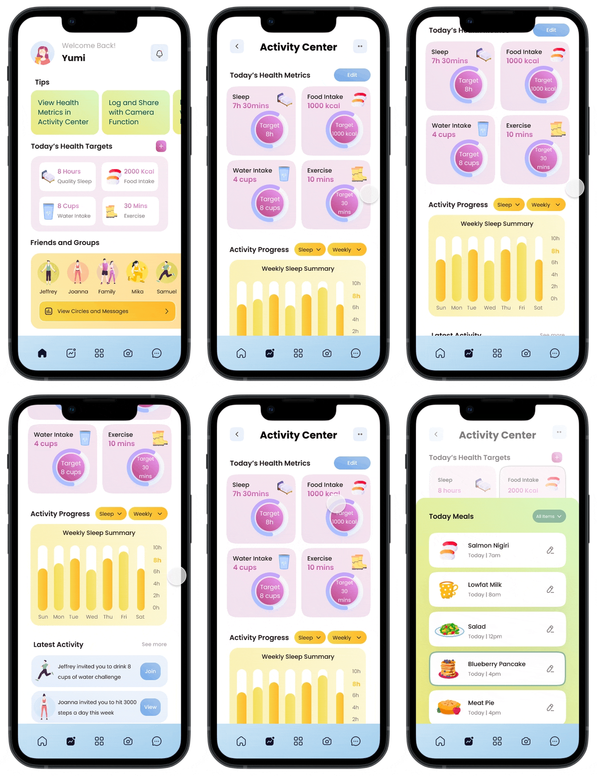
2. Activity Center
- Name change from “Activity Tracker” to capture a user’s goals, actual metrics, and latest activity
- Trimmed down the layers of the activity tracker to a detailed list of items for each goal by incorporating both the goals and actual metrics in the same circle
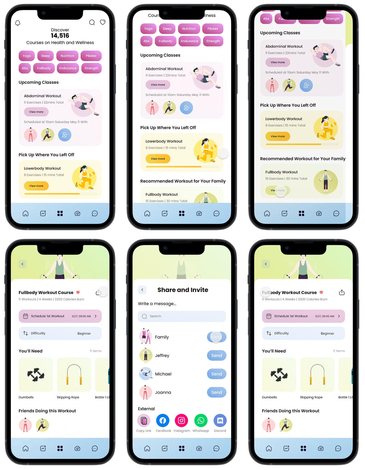
3. Discover Courses and Camera
- Added details of other friends doing an upcoming class and the function to add more friends to help users feel more motivated by doing classes with friends and family or by seeing other people doing the same workout through vicarious learning
- Added “write a message” and another screen confirming a message sent with extra confirmation of to-dos for the courses and camera sharing mechanisms to facilitate the flow
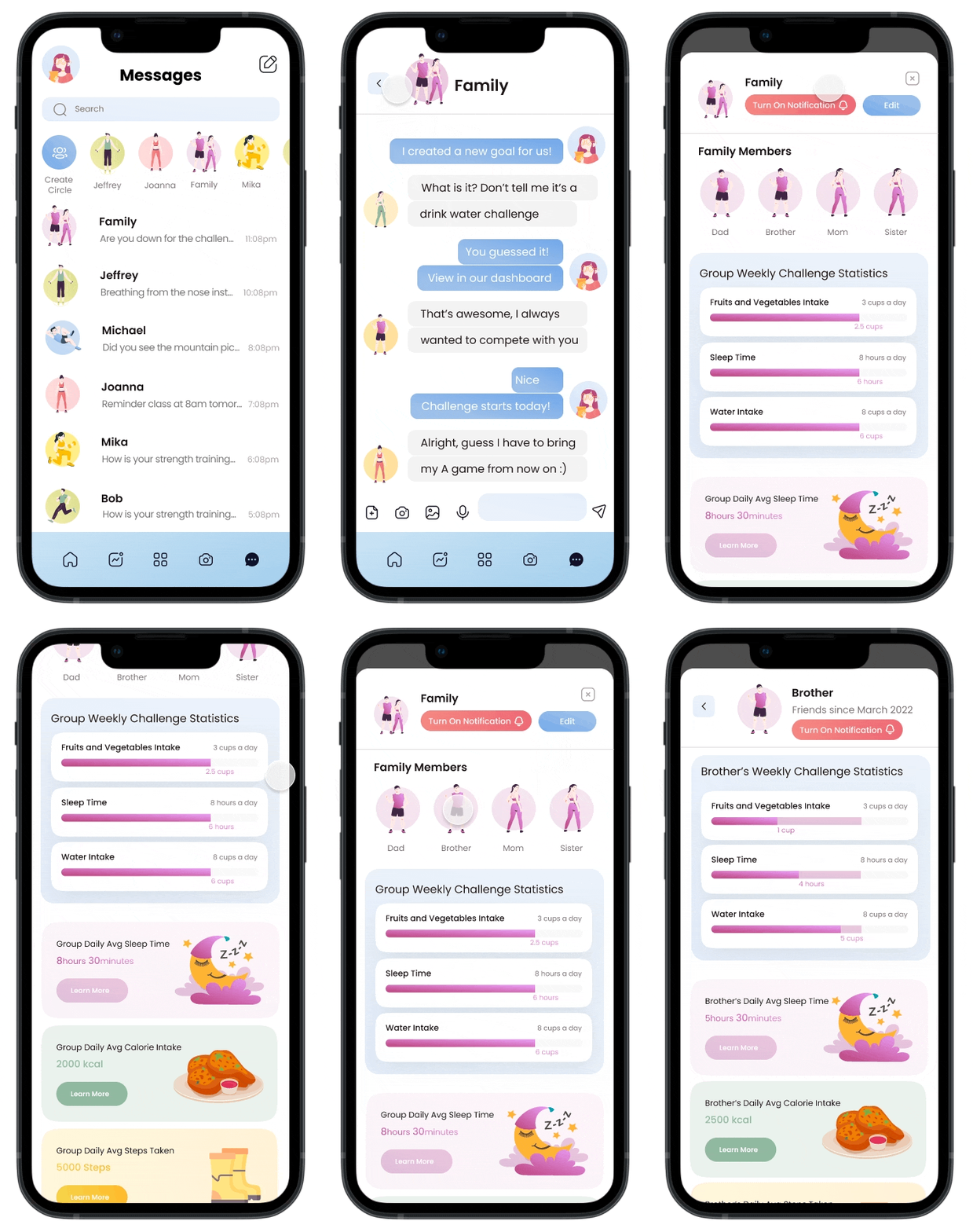
4. Social Groups
- Limited social interaction with friends and family only as users indicated that they are unlikely to engage a lot with strangers on the platform
- Created an individual profile page to show statistic comparison with a specific person
The Conclusion
Add more social functionalities to increase interactivity between members
Reflections
So far, the usability testing results show that the hypothesis we are testing is on the right track to serving as a Minimum Viable Product for Vivace Health’s new version to launch if the company desires.
We could conduct another round of usability testing to see whether there are additional points that are confusing for the users. It would also be helpful to discuss with the engineering team the implementation feasibility of my current prototype for changes.
In the meantime, the changes to version 2 of the prototype will focus on:
- Adding individual rankings within the group or homepage to add an element of comparison between people
- Consider a brand new page for social interactions instead of just the messaging page to include more challenges and goals for inspiration
Learnings
Social value triumphs quantitative data synthesis - even if an app is very good at providing accurate measures, without social value, the app cannot sustain its user engagement.
Recommended Focus
Adding individual rankings within the group or homepage to add an element of comparison between people. Consider a brand new page for social interactions instead of just the messaging page to include more challenges and goals for inspiration.


