Redesigning the Food Journaling Experience for a Startup*
*Disclaimer: due to proprietary reasons, “Taberu” used throughout the case study is a creative startup name per the request of the company
Role - Product Designer
Timeline - April to May 2022
Duration - 6 weeks end-to-end design process
Team - Lead Product Designer + 2 Contract Product Designers
Type of Design Services Offered - UI / UX, designing to update existing experience
Overview
A food journal startup that prioritizes mindfulness
- I was hired by a food journaling company named “Taberu” to redesign the app and validate ways to expedite the current data entry user experience and track habits for a more efficient data entry, with my team
- The company is a pre-seed and private company with around 20 employees located in the Silicon Valley
- The application has been live for 5+ years, with 8,000+ reviews on the App Store, and is listed under “10 Essential Nutrition Apps” on App Store
The Challenge
A tedious data logging process
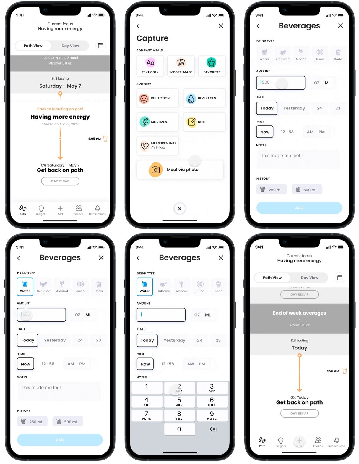
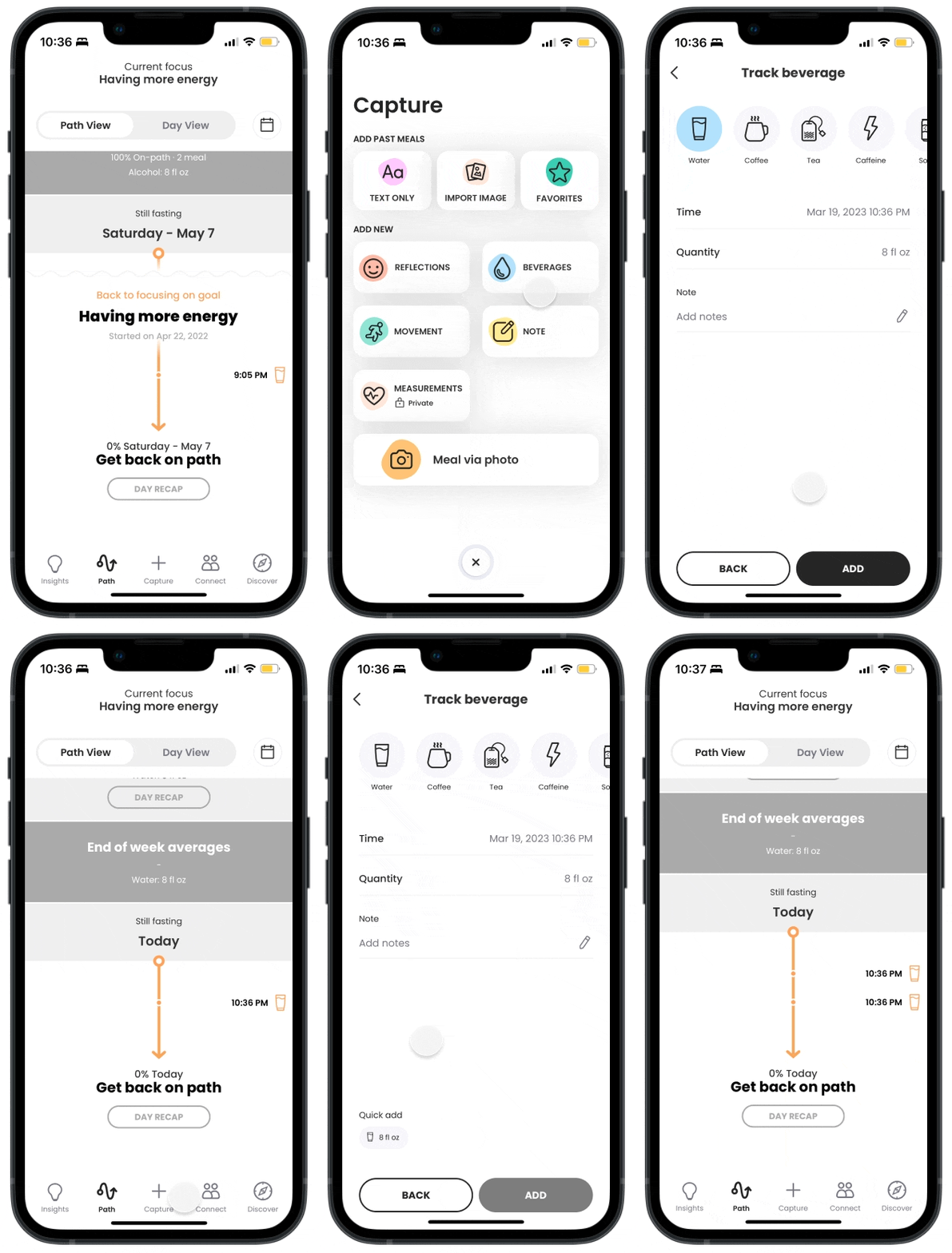
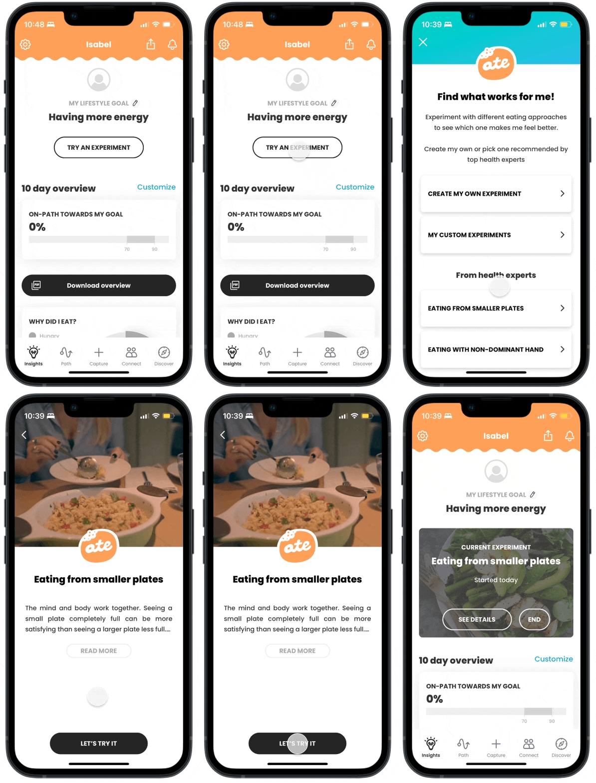
Existing Taberu users can log different items such as reflections, meals, beverages, movements, notes, and measurements through “Capture”. Similar to a journal, existing users can also view a timeline and overview of all the items logged in the past on the “Path” tab.
Research
Users want ease of use and goal setting
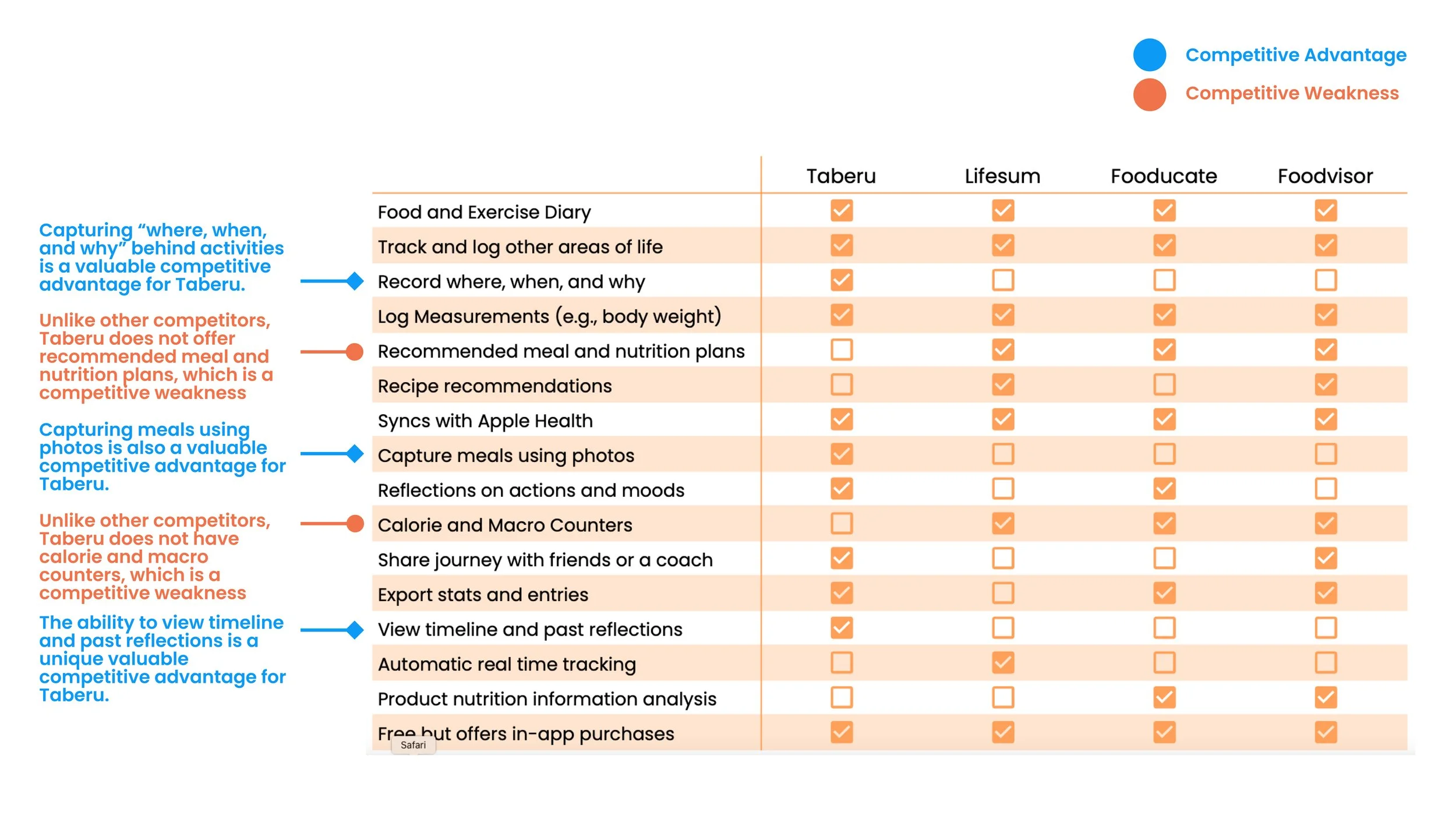
I did a lot of discovery work which included going through 100+ app rating reviews, conducting a competitive audit, and 5 user interviews. Here are the top things I learned:
1. Usability issue - too many clicks are needed to log an item, especially for beverages
- Users found that logging everything every day is takes up too much time which delays the act of logging
- This hinders the accuracy of each log as users tend to forget the details of their meal or beverage
- Logging one cup of beverage takes 5 clicks (around 20 seconds), if there are 8 cups of water to log each day, that will take more than 40 clicks (~2-3 minutes) just for logging water alone
2. User retention - lack of goal-setting features = lack of incentive to keep using the app
- Users who are new to the app try to be diligent but tend to drop off from the app after a week
- The lack of additional features such as goal setting keeps users from being engaged
- From secondary research comparing with other products that focus on habit building such as Habitica and Fitbit, habit formation is heavily linked to user retention
4. The company has 3 main competitive advantages and 2 main competitive weaknesses
Advantages
- Ability to record where, when, and why
- Ability to capture meals using photos
- Ability to view timeline and past reflections
Weaknesses
- Lack of recommended meal and nutrition plans
- Lack of calorie and macro counters
3. Users want to feel good, empowered about themselves and their choices, and have the ability to develop a healthier mindset towards their habits by bringing clarity to their actions
“When I use the app during my busy day, I want to track things as easily/fast as possible so I can get back to my already hectic schedule.”
“When I track a meal, I want to quickly save it and move on, so I can get back to enjoying my meal without thinking about the journal at all or feeling like I am being judged.”
“When I use the app I want to be exposed to the idea that life is an experiment, to be kind to myself and curious so I can release judgment and begin my journey of self-reflection/move towards my best future self.
The Goal
How might we simplify the action of entering information and encourage healthy habits through food journaling?
I narrowed down the goal further into 3 main different areas to consider:
1. Improve speed & usability to enter information for “beverages”
2. Allow users to create habits out of currently available capturing options
3. Improve the user interface on the homepage specific to “beverages”
Ideation
Expediting and familiarizing the logging experience
I pitched my designs for…
1. Improving the usability issue of a tedious logging process
- Setting up desired functionalities during the app’s onboarding (e.g. food, water, movements)
- Synthesizing and selectively inputting pre-populated meals
Team Takeaways: The idea of setting up “shortcuts” or “favorites” to reduce the number of clicks when entering new information resonated with the team
2. Improving user retention by adding goal-setting and reward features
- Setting up goal intentions along with reflection
- Adding reward system and streaks
- Pie chart synthesis and everyday goal visuals for quick quantitative data
Team Takeaways: The team had different ideas of what the habits section would look like, especially since it would have to integrate with the currently displayed metrics on the “Insights” page. Rewards also felt a little contradicting to the company’s core value of non-judgmental but the team generally felt like these ideas are a good start
3. Developing a healthier mindset towards users’ habits by bringing clarity to their actions
- Daily reflections for users to evaluate their actions and routine to uphold the company’s value of mindfulness
- Pie chart synthesis of feelings
Team Takeaways: The lead product designer really liked these ideas that connect introspection with mindfulness, a core value of the app
Wireframes + Round 1 User Testing
Validating 3 flows: Regular Add, Quick-Add, and Habit Tracking
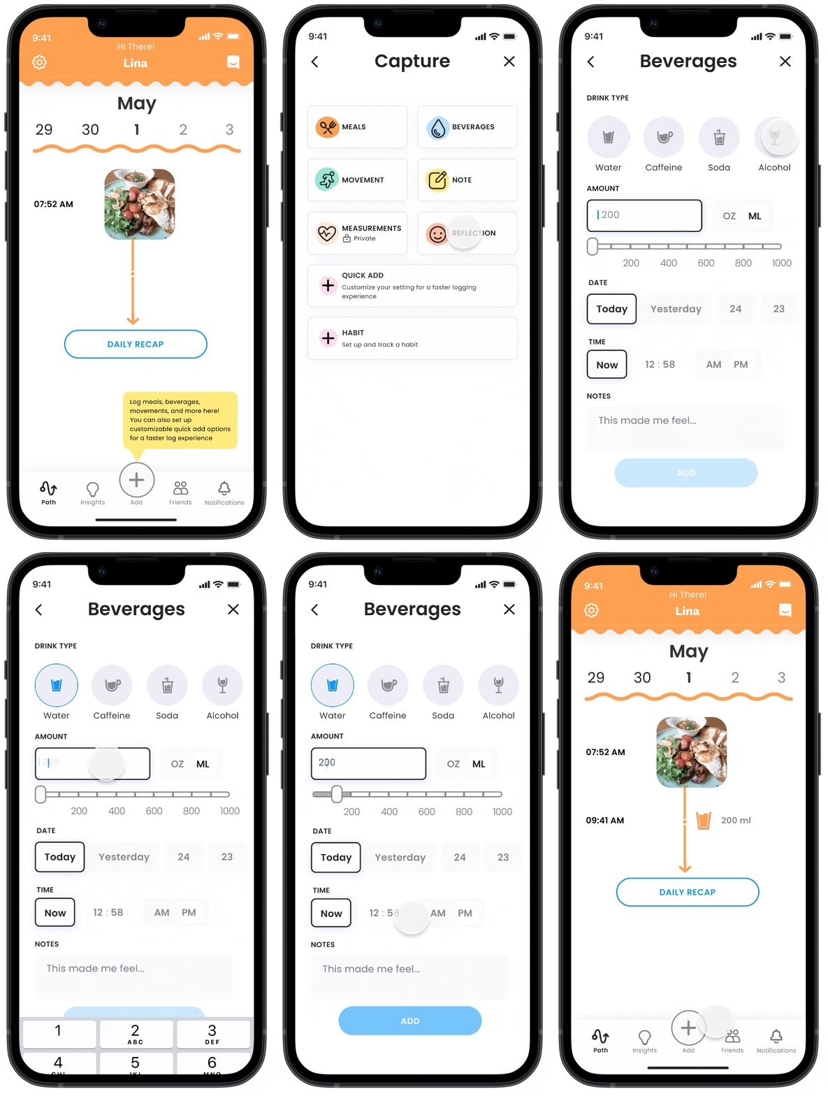
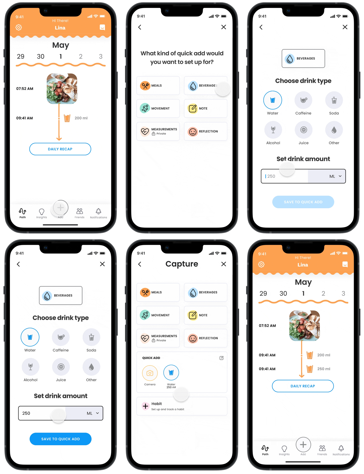
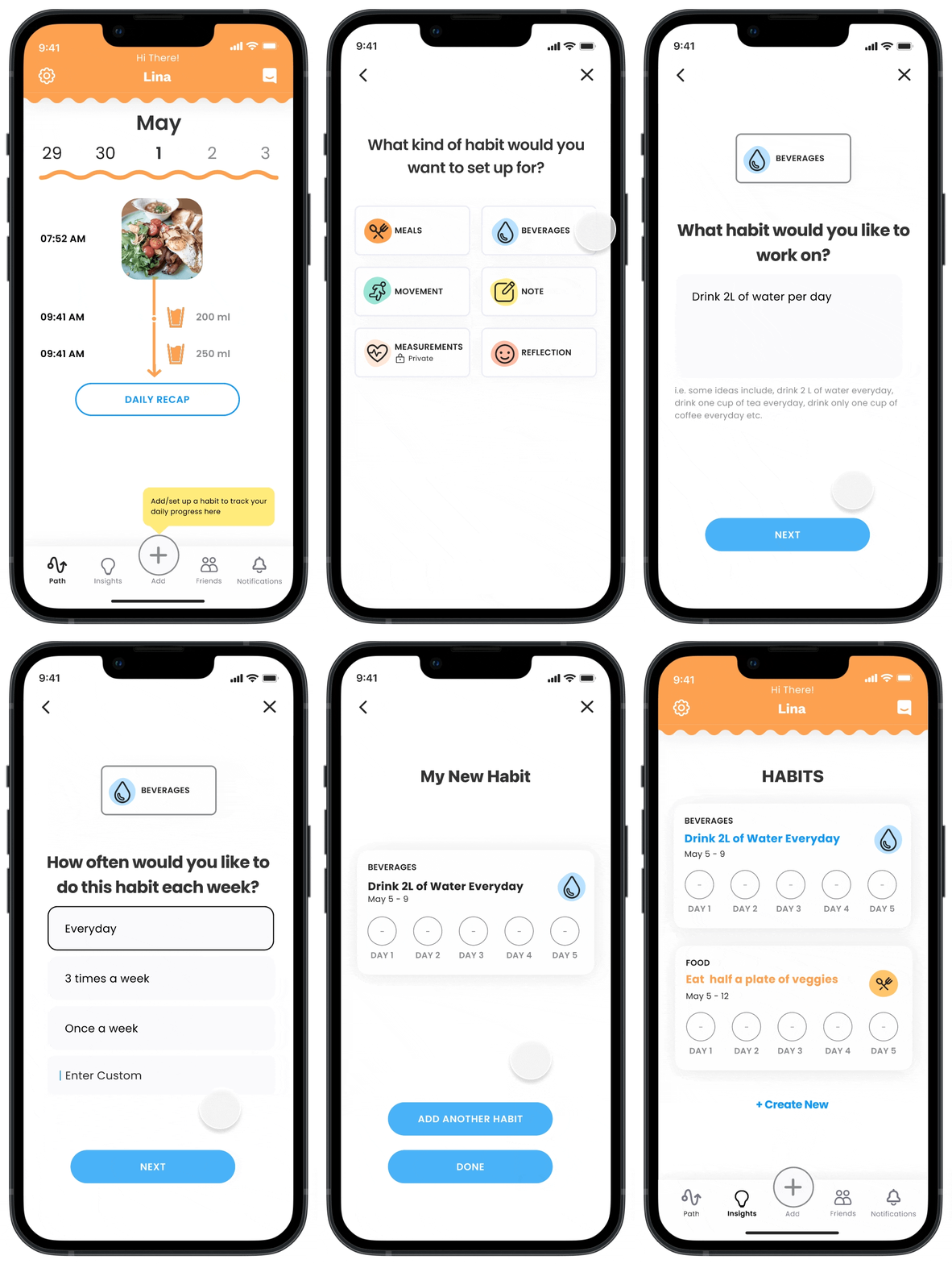
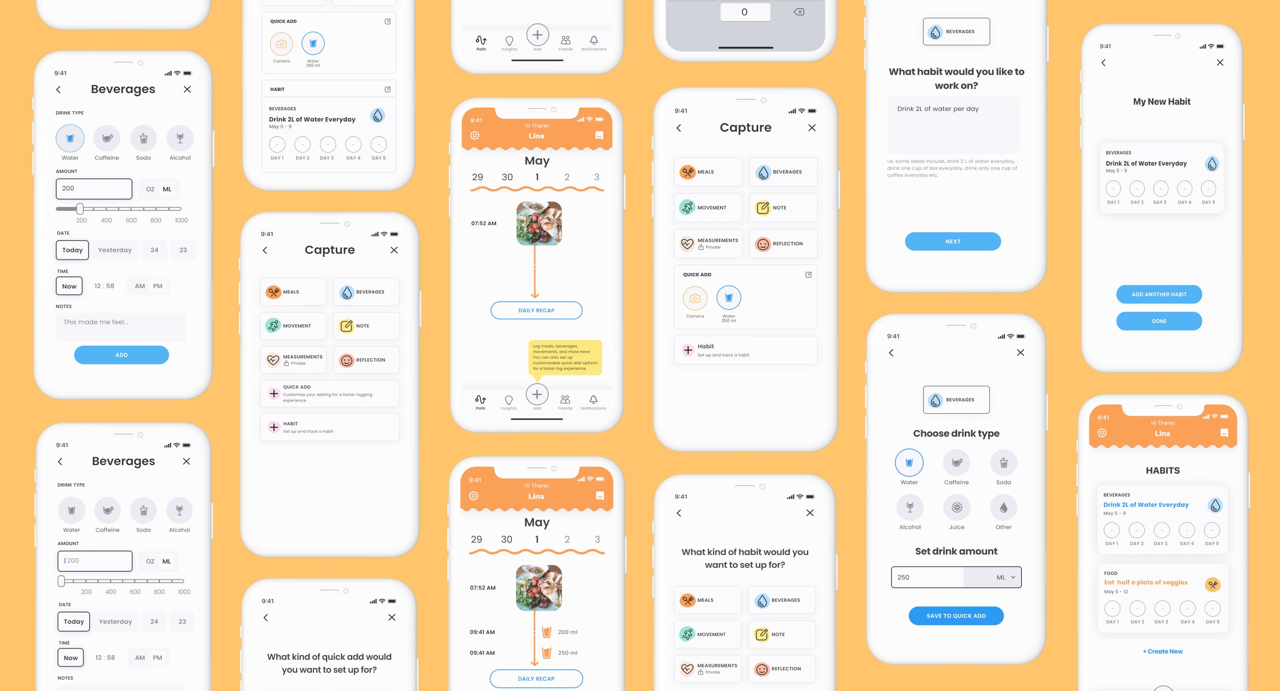
We decided to set up 3 flows for ease of usability testing and segregation for first-time users. For tasks done within our guerilla testing, we asked users to log a cup of water, set up a quick-add function, and habit for flow 1 - 3 below.
1. Regular Add Flow
This allows users to log a one-off item instead of a recurring favorite they would like to use in the future.
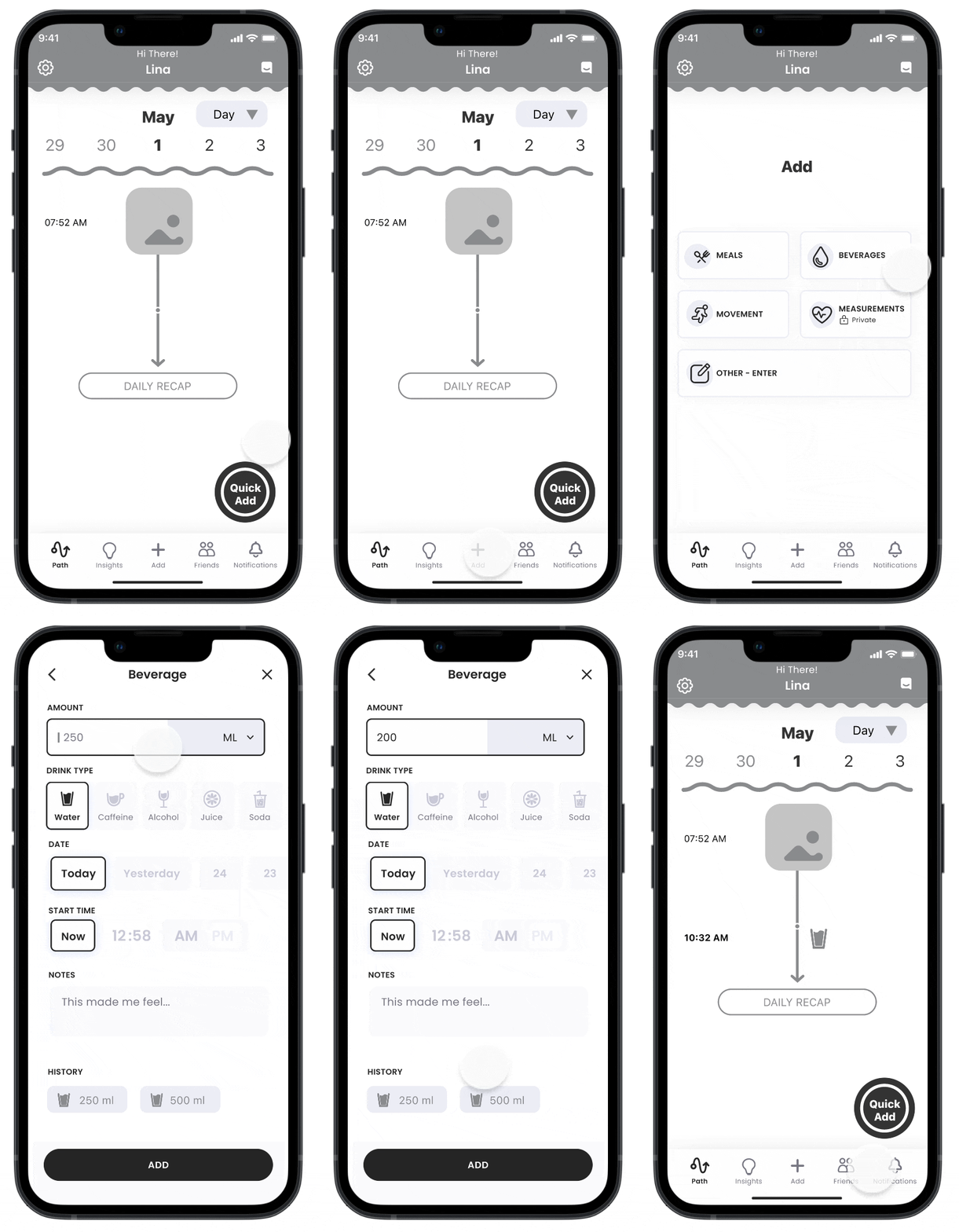
2. Quick-add Flow
This allows users to set up a favorite log that they anticipate using frequently in the future.
*Users found it difficult to distinguish the functional differences between regular add and quick-add
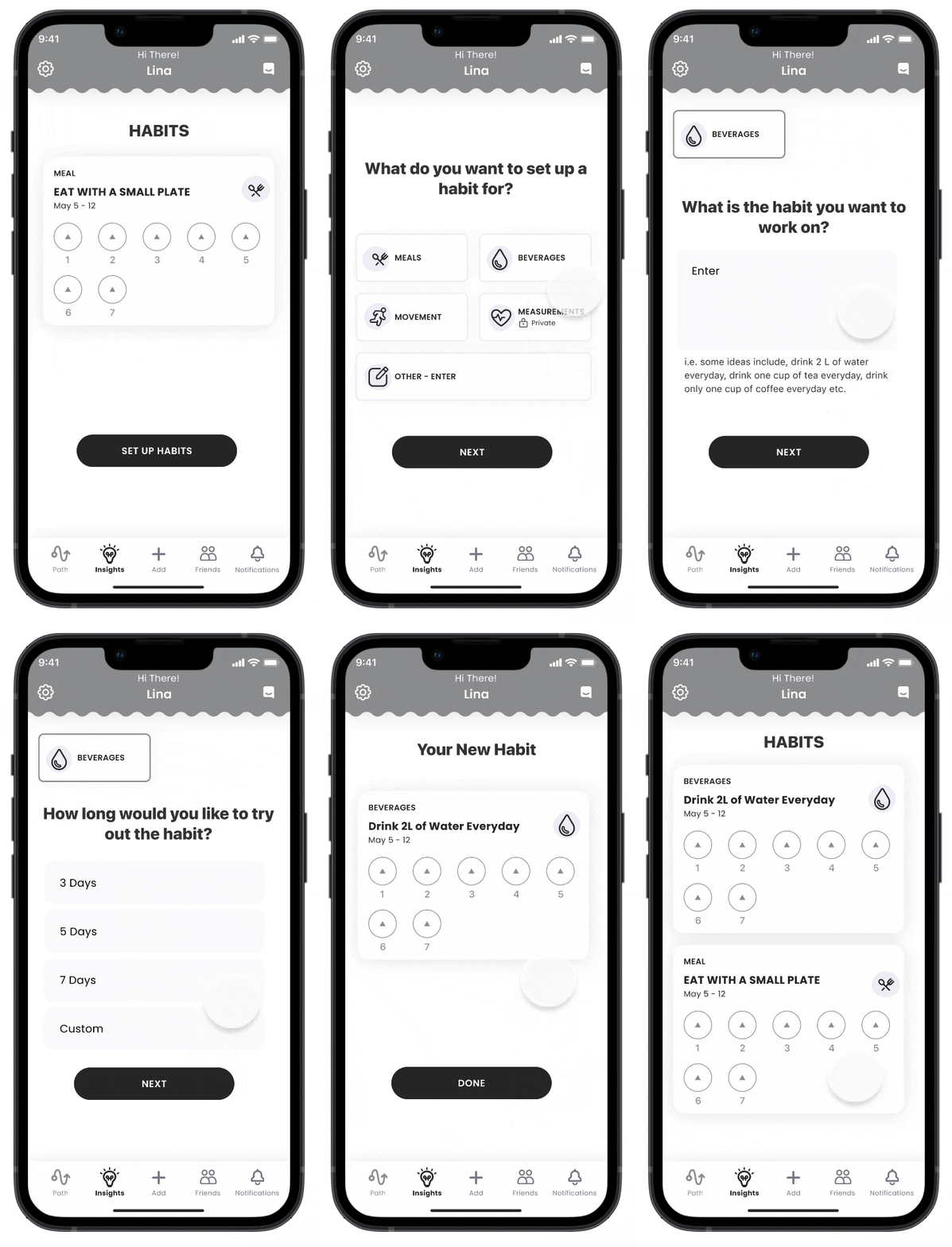
3. Habit-tracking Flow
We set the habits tracking entry point on the insights page, with a series of questions to set up a habit.
*Users also found the ways to enter quick-add and habits confusing
Round 1 Feedback Implementation and Round 2 User Testing
Centralizing Quick-Add and Habits
After considering users’ round 1 feedback, the biggest change implemented was incorporating the quick-add and habits function in a central add button as the main function of the app. In addition, we decided that a dialogue box would be helpful for first-time users to navigate through the distinction between a regular and quick-add.
After the second round of usability testing with 5 users in their 20s-30s, we found out that although there were some minor comments on UI, wording, and the necessity of an extra screen when entering the amount of water for the quick-add feature, users were able to navigate most of the flow with ease.
Final Solution
Improving number of clicks to log from 5 to 1
For the final MVP, we improved the number of clicks it takes to log beverages from 5 down to 1 thanks to the centralization of quick-add and habits as the main function to inspire user retention.
We also added a toggle for the input of water amount for accessibility and edge cases where users prefer to estimate or speed up their water amount.
After setting up a quick-add, users can go back to the home screen for additional instructions on the quick-add feature they have just set up and make edits accordingly. From the capture screen, the users can add habits on top of making modifications for quick adds as well.
For the habits flow, another dialogue box before users create a habit was added as some users desired a more distinguished description.
In addition, we added “how often would you like to do this habit each week” for users to document and track their progress, as users indicated a desire to quantify their data more.
Conclusion
UX Impact and 2023 Company Buy-In
Reflection
Thanks to my team and this opportunity, at the end of the project I learned to…
- Present and explain my design choices and rationale to different stakeholders such as the lead product designer, engineer, and my peer designer
- Navigate different opinions through rounds of iterative refinements that strengthened my critical thinking, cross-functional communication, and visual design skills
- Design to simplify for users no matter if it’s the entry point, the main function, or the number of clicks/flow
- Take the brand culture and existing users into account when considering new functionalities to add or remove
North Star Visions
If I could spend as much time as we want on this product, I would:
- Implement more obvious rewards and gamification components
- Generate insights automatically for habit tracking and logging process
- Integrate the current recommended changes from our usability tests with the existing ecosystem
Impact
I’m proud to have worked on such a unique and live product with an established entry point. We were able to improve logging speed by at least 8 seconds and reduce the number of clicks it takes to log one beverage from 5 to 1. In addition, over the course of half a year post our project, the number of users increased by more than 800+. During the 2023 version of the application, the company has also implemented the “quick add” function and “experiment” within the ecosystem, signifying that our designs were successfully considered by major stakeholders post our project.


