Sprint: Designing a home decor shopping experience
Role - Product Designer
Project Type - Conceptual Design Project
Timeline - February 2022
Duration - 1 week modified Google Ventures Design Sprint
Type of Design Services Offered - UI / UX, designing for new website experience
Overview
Finding cohesive, affordable, preferential, and stylish home decor items
- This project is a demonstration of my UX design skills and was developed in response to a design prompt - the resulting case study showcases my ability to design under tight constraints utilizing a Google Ventures Design Sprint style
- House2Home is an e-commerce website that sells small home decor items and accessories that can be packed easily
- The company saw an opportunity to help people who are just moving to a new apartment to create a “starter kit” to instantly decorate their space within their budget and to their design taste
- I volunteered myself quickly to brainstorm and test out a solution by running through a modified Google Ventures design sprint
- By gaining a thorough understanding of the problem, brainstorming ideas, creating low and high-fidelity prototypes, and validating them through user testing, I have arrived at an innovative solution: a website designed as an automated personal interior design assistant
- My proposal will provide customized recommendations to users, tailored to their unique preferences and needs, creating an intuitive and personalized shopping experience.
The Challenge
Shoppers struggle to narrow down stylish, complimentary home decor pieces that fit their budget, the amount of time willing to spend on shopping, and desired styles.
Research
Overwhelmed by choices and cohesiveness
I did some discovery work which included studying industry leaders and conducting user interviews with ten home decor shoppers. Here are the top things I learned:
1. Users tend to browse online for inspiration to shop but get overwhelmed quickly by the number of choices
“I find lots of cool little items that I like, but I never know if they’ll all look good together in the same room until I buy them. Usually, I get overwhelmed and end up not buying anything.” - Usability test participant 1
2. Users are unsure if everything will look good in the actual space even though they know the look or vibe they are looking for
“I know the “look” I want, and how I want to feel when I walk in… I just don’t really know what products to buy to pull it off” - Usability test participant 2
3. Users are concerned about their apartment’s limited space
“My ideal way to decorate my apartment would be to hire an interior designer who specializes in tiny houses … since someone will know my taste and how to find things to make that look come to life”
- Usability test participant 3
The Goal
How can we create a time-efficient home decor shopping experience?
I narrowed down the goal further into 3 main different areas to consider:
1. Cater the design for shoppers who move around often and want smaller items
2. Allow users to shop efficiently and quickly for the individual items they need without compromising look and quality
3. Ensure maximum style impact that fits the shopper’s desired feel and budget
Ideation
Reducing time and energy to browse and select
Possible end-to-end experience map
In order to visualize the steps it takes to complete a home decor purchase for an apartment, I thought about what the steps a home decor shopper would take and mapped out a quick possible end-to-end experience for House2Home’s target shoppers below.
Divergent and convergent thinking
Next, I brainstormed via the crazy-8 method and narrowed it down to 3 potential concepts:
1. Concept A: Quiz style (step-by-step assistant)
2. Concept B: Filters approach (similar to an e-commerce site where a user searches for an item and filter down)
3. Concept C: Bundle Suggestions (a user would choose the first product, then the platform suggests sets of products that complement each other, e.g., a bedding set that includes sheets, comforter, and pillows)
Since the most important product purchasing step is when users browse their recommendations and decide on specific items to purchase, this step is the most critical and complex part of the design. I decided to go forward with concept A and expand upon the idea by designing a virtual assistant in the form of a style quiz that gives out recommendations. This design will allow users to select desired pieces that match their budget in a short amount of time.
In order to expand on the users’ action flow, I broke the style quiz down into a diagram. The style quiz would consist of 3 components:
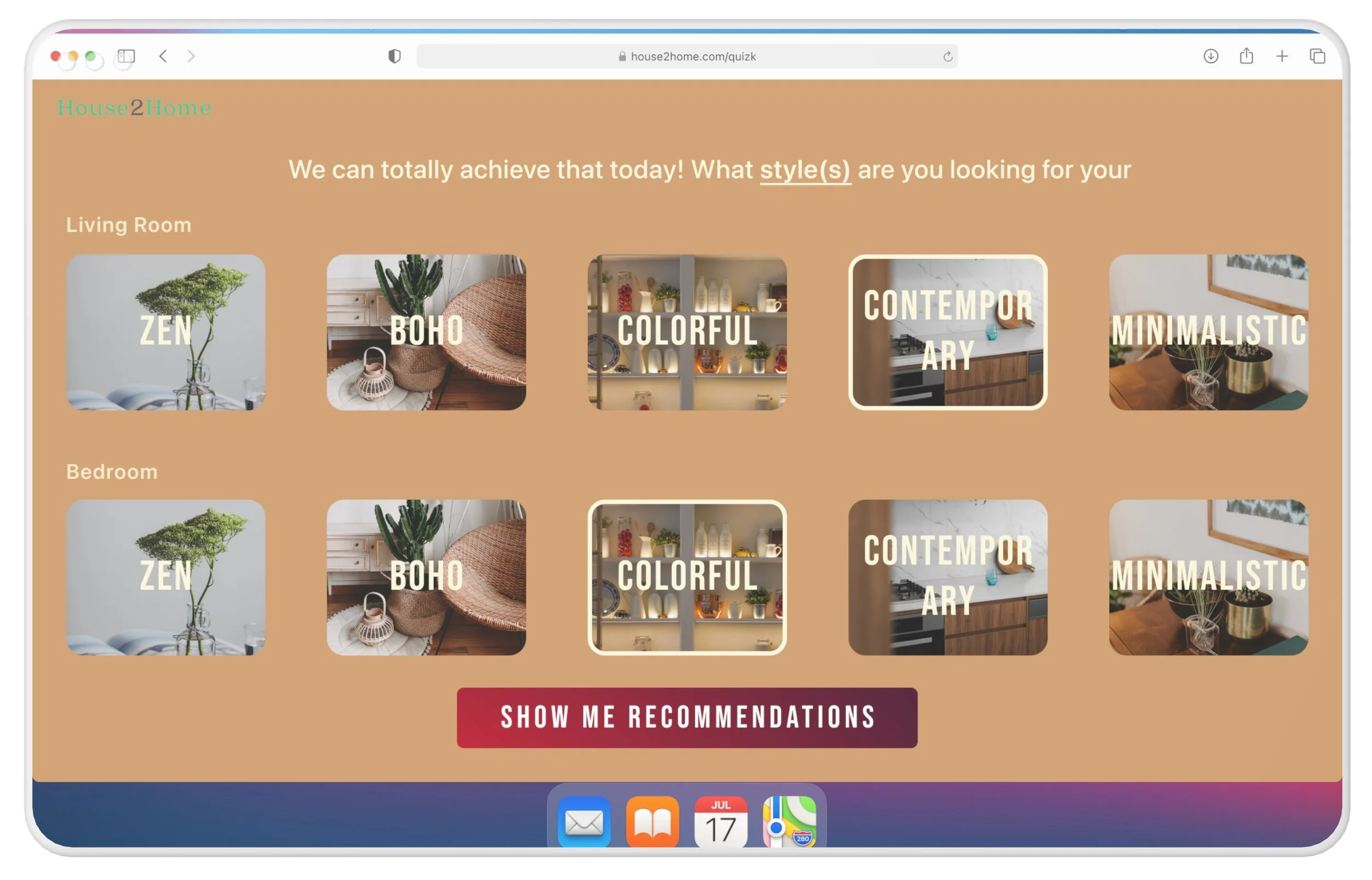
1. Answer a set of relevant questions that allow users to choose their preferences regarding which rooms, styles, and budgets they are looking for on this shopping trip
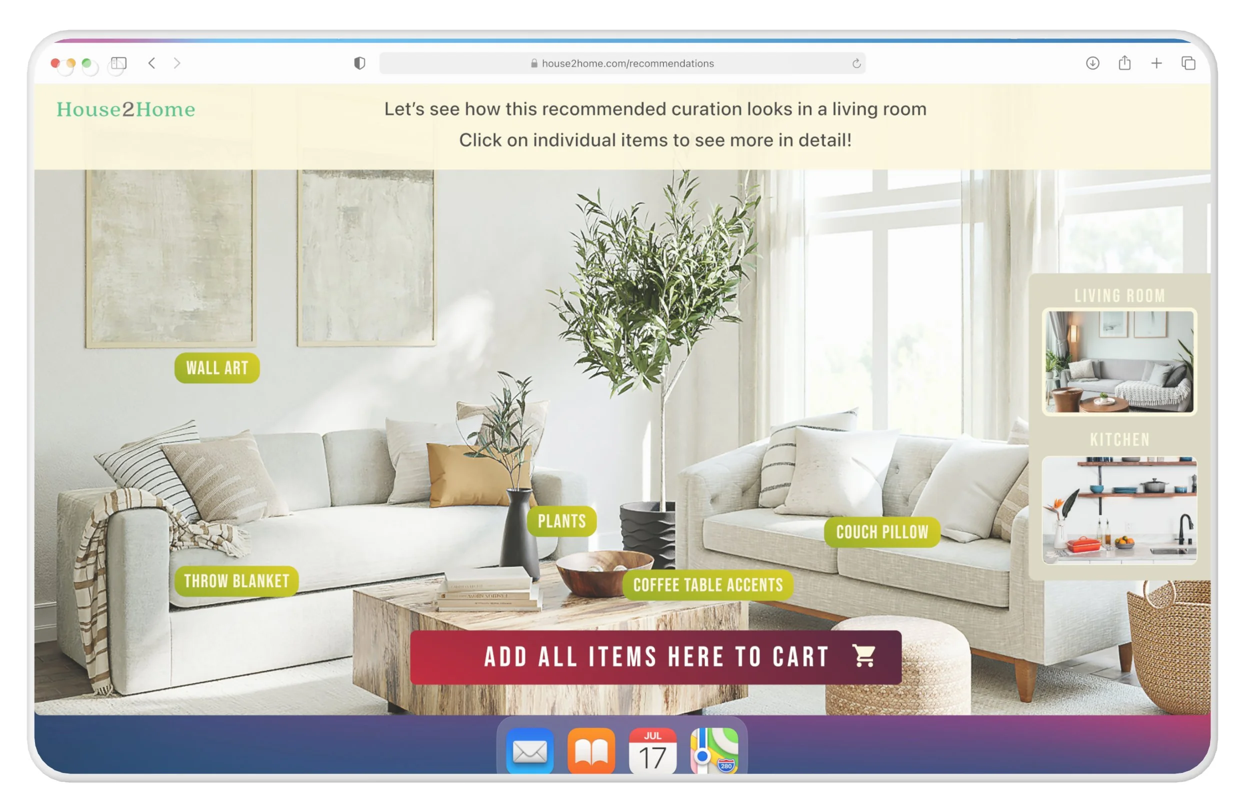
2. Visualize individual pieces in a room
- The platform would generate curated recommendations in a specific room (e.g., bedroom, living room, etc.) based on the user’s answers to the questions;
- By allowing users to view an entire room filled with recommendations that most match their preferences, saves time for the user and collapses a stronger sense of cohesiveness through the act of visualizing
3. Browse specific item
- From the room, users can then explore a specific item in more detail before purchasing
In order to quickly ideate the storyline of how users would interact with the website’s interface, I sketched a 9-panel storyboard showing a user navigating a personalization home decor quiz, viewing recommendations and a specific item, then finally adding items to a cart.
Prototype and Usability Testing
A virtual interior designer to personalize and visualize a shopper’s home space
I conducted 5 usability tests with interviewees who frequently shop or recently shopped online for home decor items, and asked them to “buy a pot of plant” on House2Home.
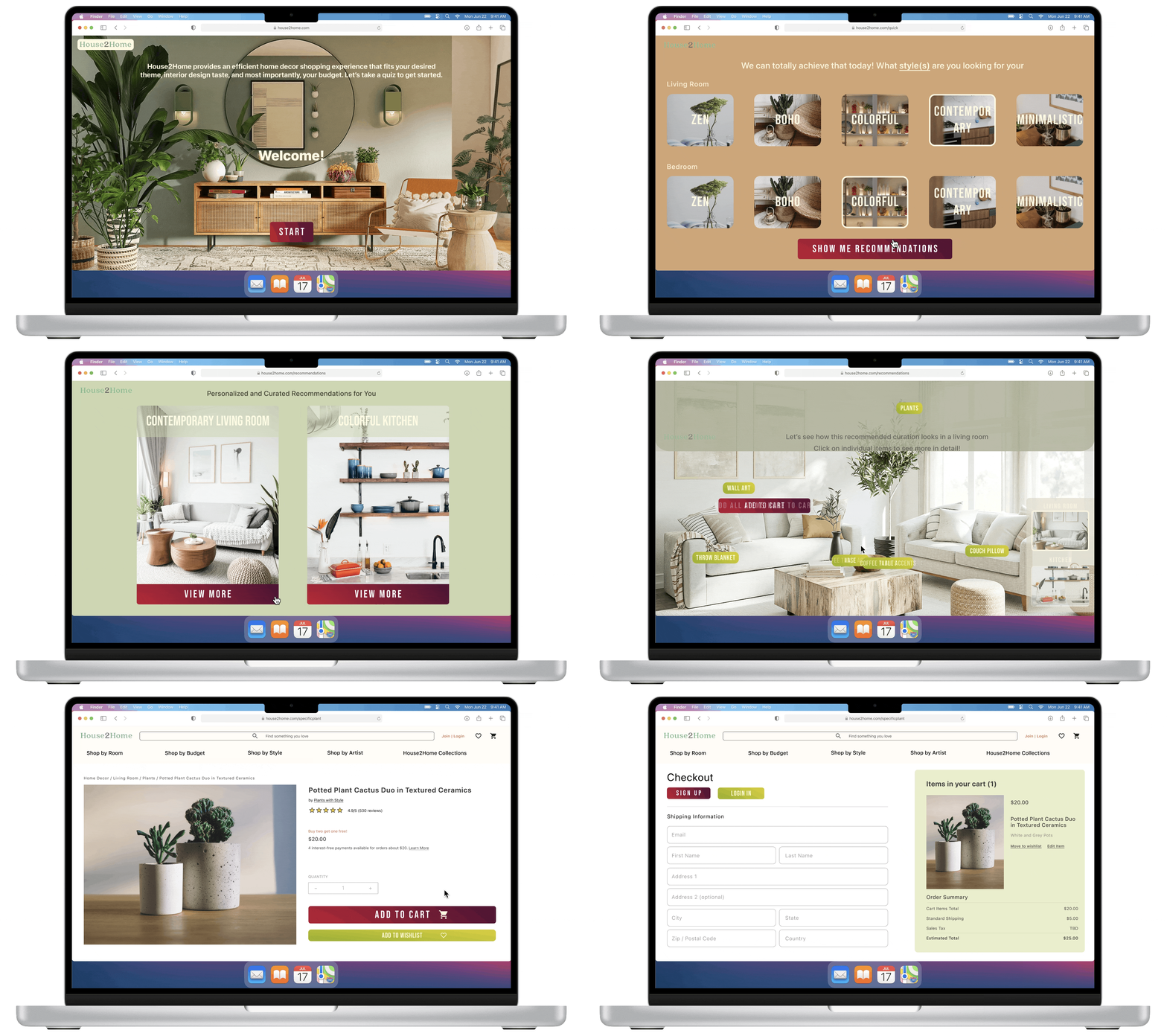
1. My prototype models a personalized quiz that walks users through their desired space, total budget, and styles for each room allows users to visualize their curated selections, and helps them buy the suitable starter kit for their home efficiently
Users loved the attractive front page, colors, UI, continuity between pages, and the idea of a personalized interior designer and a curated selection but weren’t sure whether the quiz is for a specific item or an entire room in the beginning
2. Each generated recommendation by the website displays a curated selection of items that go well together within the confines of the styles the user selected
Users navigated the room visualizer well but got stuck on navigating and pivoting to another room recommendation
This was a main concern regarding the time they would spend as redoing the quiz or navigating backward on different rooms affects the continuity of the flow and effectiveness of the generated recommendation in the first place
3. The user can then explore each item further by viewing its descriptions before placing an order, then if the users are satisfied with the recommendations, they also have the option to add everything to their cart, then finalize their items accordingly in order to save time and energy in the shopping process
Users couldn’t commit to deciding on an item recommendation as they have limited information about the product to even start considering the product itself
The Final Solution
Refining UI for a smoother experience
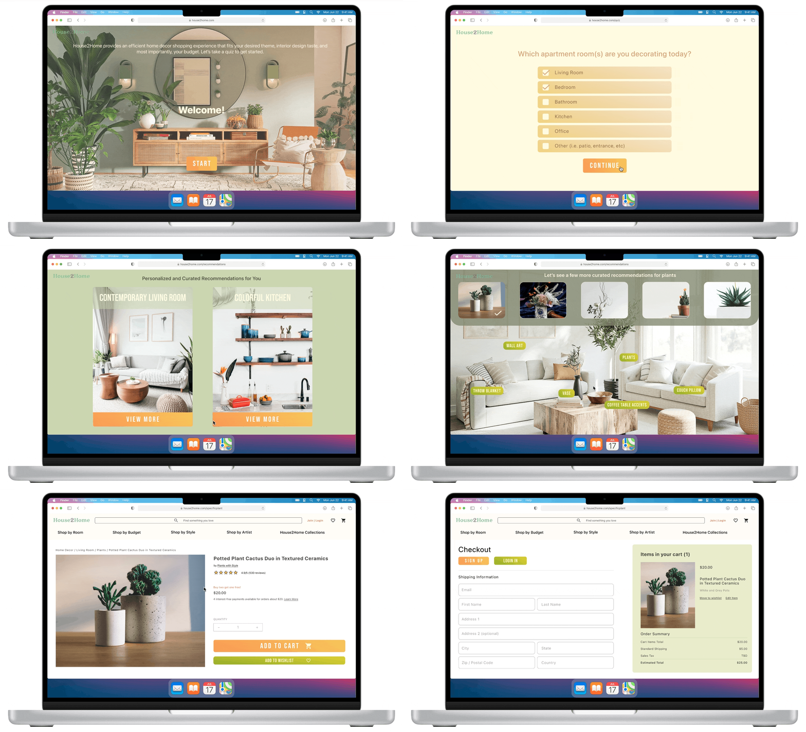
Post the usability tests, I quickly went back to my preliminary designs and implemented the areas of improvement above. The second version of the design prototype is displayed as follows:
1. Regarding users’ confusion on whether the quiz is for a specific item or an entire room, especially at the beginning of the quiz, I edited the phrasing of the budget question to “total budget for the entire purchase” to further solidify the idea that a user can complete all their needs of an entire apartment on this platform
2. Regarding the user’s pain point of navigating between rooms, I added a side panel with a similar UI to allow users to switch between the different recommendations if they chose to generate multiple room inspirations. This will help with ease of navigation and flow continuity relating to generating recommendations within the platform
3. Regarding users unable to commit to a particular item recommendation, I added the price detail and a direct “add to cart” option for users to decide if this product is what they are looking for before viewing the specific details
4. Lastly, I made some UI teaks such as updating the colors of the major button and updating UI components for the style selection page as some users had difficulty spotting the selected checkmark and found clashing styles in the first prototype version
The Conclusion
More usability testing and implementation feasibility
So far, this solution is on the right track to serving as a Minimum Viable Product for House2Home to launch now if the company desires. This design sprint was a fun and eye-opening opportunity to quickly come up with a design prototype within a week.
North Star Visions
- Adding designs to include users who have no idea what they want in terms of style
- Explore ways to display different variations of the object within the same room when viewing the recommendations for each room
- Adding descriptions for individual items on the room view page
- Finding ways to account for individuals who wish to mix and match the styles within the same room
Possible Next Steps
A few possible next steps would be to:
- Conduct an unmoderated usability testing with a larger participant pool to see whether there are additional points that are confusing for the user when shopping for their home decor starter kit
- It would also be helpful to have a discussion with the engineering team regarding the implementation feasibility of my current prototype for changes
- Interviewing possible stakeholders to gauge interest in the concept/investing could also be a good option


